Just like how frogs love using their powerful back legs to jump into the air, we here at Razorfrog love to launch things. It’s one of our natural dispositions – it’s why we put “frog” right there in the name. Here’s the latest round-up, from our lily pad in San Francisco, launched into the stratosphere.
First up are two of our oldest, dearest, most beloved websites that were due for a redesign.
KZSC’s website needed to be pushed into the glittering future with some very important new gizmos, like live updating song metadata, live streaming, and a display of archived content. All very chic and tidy, with some new pictures and clean design elements. It still feels like the old site– lived in and loved– but it’s very much a new beast, ready to roar good music at you.
Inspire Me Today also had a fresh coat of paint, and we went mobile focused, since that’s how the users seemed most comfortable accessing their daily dose of inspiration. With a decade’s worth of content, we also spruced up the archives, making it easy to find beloved past pieces, as well as new insight.
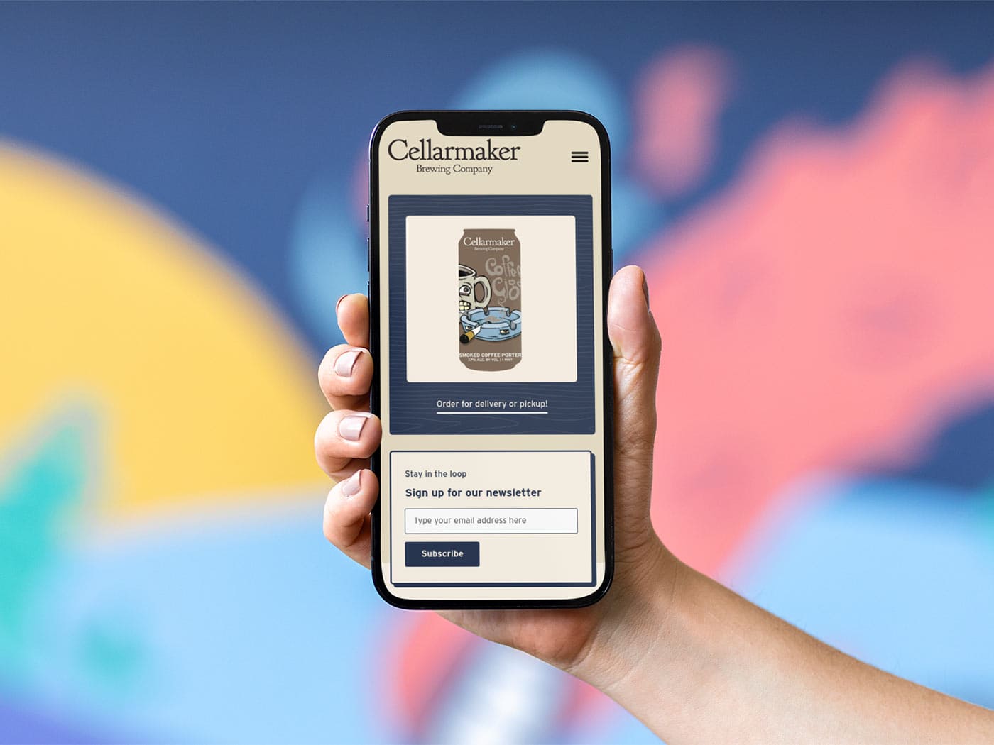
For Cellarmaker Brewing Co, it wasn’t a fresh coat of paint so much as building a new wing – an entire new location dedicated to Detroit-style pizza. Such a combination of food and their small batch beer could not go without a dedicated arm of their webpage for people to click on and salivate over, and when you wake up from your pre-food coma, all the information about the restaurant you need is there, in one rustic and comforting package.
Speaking of fresh coats of paint, we have a bunch of new folks that joined our pond of lily pads.
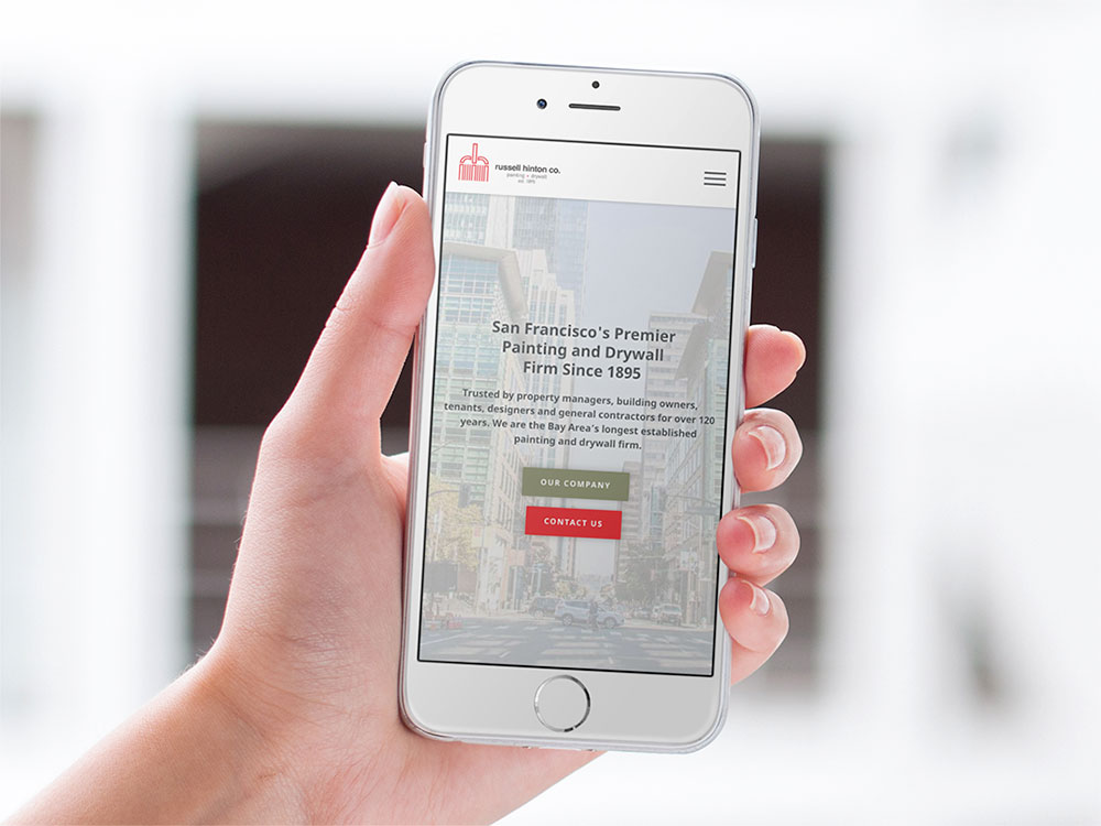
One portion of the new crew are the fine people at Russell Hinton Co., the premier framing, drywall, and painting service in San Francisco. Their website had to show off their wealth of experience and abilities and talent, all within the clean lines and easy-to-navigate style that Razorfrog is known for. Visitors go from admirers to quickly clicking that high contrast “Contact” button.
Genteel Plumbing was also in the business for a bit of remodeling. We sliced and cut, styled and blow-dried their website to bold reds and greens, the needed information as accessible as can be. It was our pleasure to make their internet tubes as utilizable and clean as the real life pipes they are known to install and service. With Razorfrog’s help, their website lives up to their business moniker.
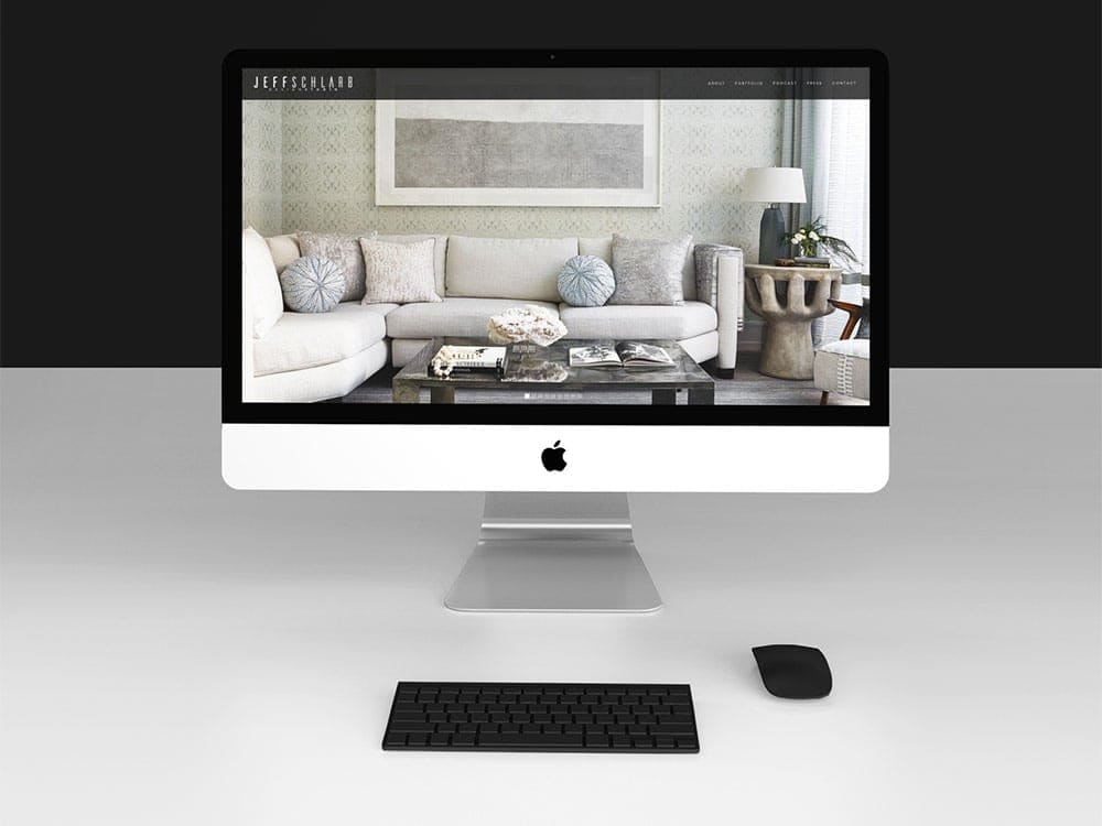
Say luxury and you might as well be saying Jeff Schlarb’s name, as we came to find out working on the website for Jeff Schlarb Design Studio. We loved working with Jeff to make his home staging, improvement and luxury leasing firm Green Couch, so designing a showroom for his work, press, and podcast appearances was a joy. We are always excited to be tasked with designing a website that has to show off stellar and innovative design. We call that “Design-ception” here at Razorfrog, and you should too.
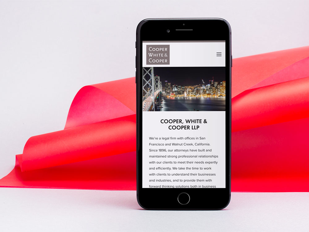
Another exciting launch is in the world of law firms. We have worked with a few of these, so we are experts at making each individual firm shine like the diamonds they are. At Cooper, White & Cooper, we took the infrastructure they’d already put together and imported it into a new, sleeker and more user friendly interface. Plus, it’s all networked, so relevant information appears where you need it. Just like you’d want from a law firm.
Same goes for Hospitality and Investment Real Estate Advisors, Inc. (“HIRE Advisors”), which is like S.H.I.E.L.D., but a full service commercial real estate brokerage and advisory firm instead of a conglomerate of superheroes. The firm’s advisors are experts in their field, and we saw our niche as showing their expertise and tying it to sweeping panoramas of San Francisco. Plus, you can sort property transactions on it, which is integral to the work they do. So showing it in a good interface that looks and acts as it should in every screen experience was integral to what we did for them.
The Razor part of Razorfrog means that we can exist on that razor’s edge of a katana sword, slicing out what you don’t need on your website to make room for what you do. What we launch (with the aforementioned powerful back legs) are as light and streamlined as can be, getting your employees and consumers and friends and family to see what you want them to see when they visit your website. Or lily pad. This metaphor sure got mixed. It’s a side effect from our excitement at doing all this good work for you all.
Ribbit, y’all. Let’s spring to spring.


