A new year. It’s like a freshly paved road leading to a promised land, 365 (well, minus 21) days that could all point to a brighter tomorrow.
At Razorfrog, we have been tippy-tap-tapping with our little froggy hands, and now we are ready to launch sites the way same we launch ourselves into the air with our powerful back legs: with strength, power, precision, and a desire to reach the greatest of heights.
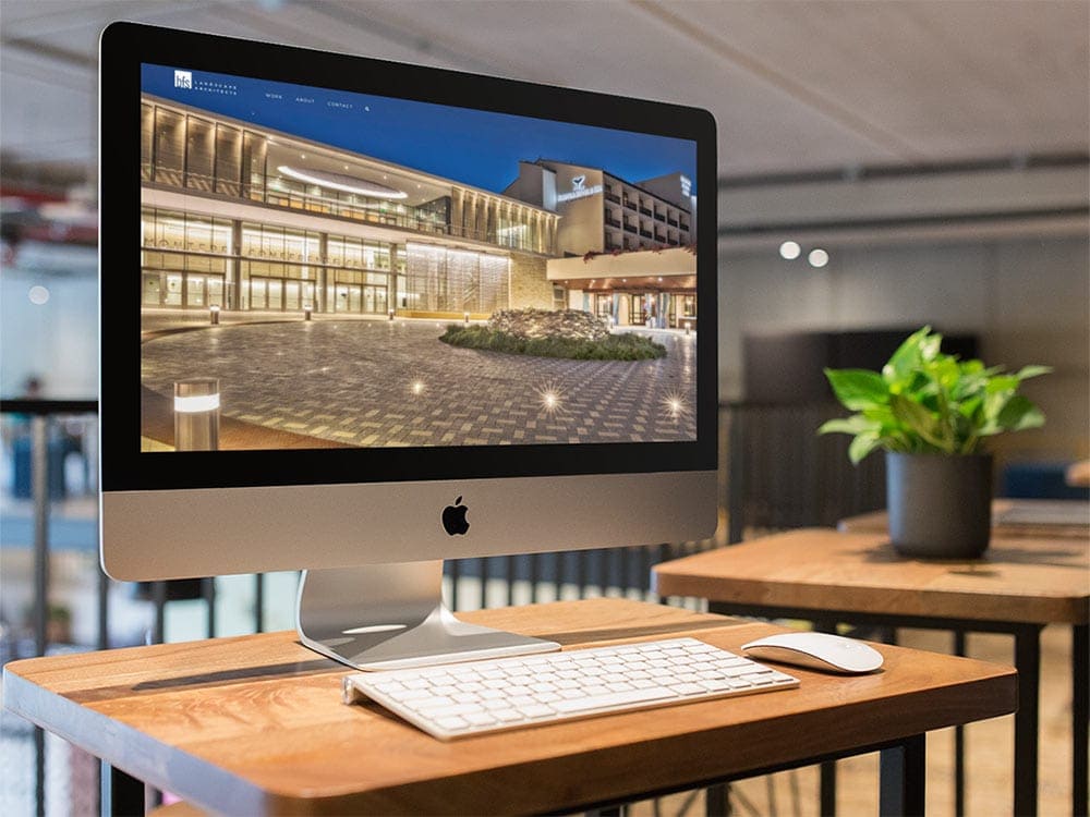
It was a joy to work with BFS Landscape Architects, building a digital landscape in which their meatspace architectures will be showcased. The site is a beautiful gallery and informational spot for clients looking for their innovative and natural design, and also to the industry professionals themselves, so it had to be more than just a place to see pretty pictures and request a quote – it had to be a destination itself, with some luxurious typefaces that speak to their spacious design.
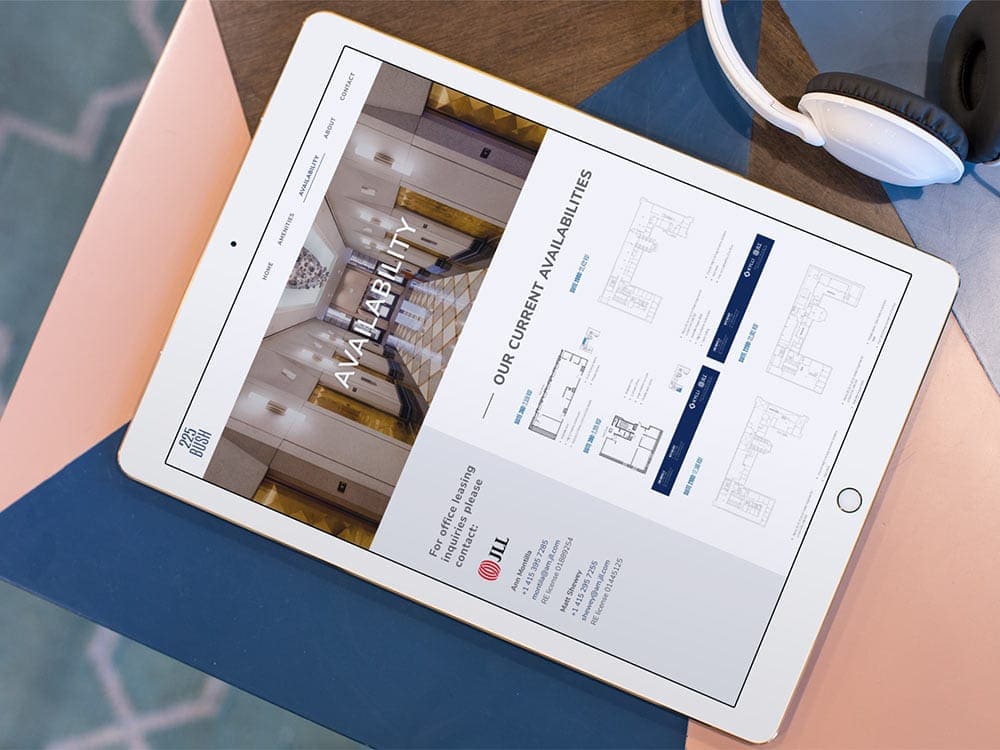
Some of the lessons we learned working with BFS we applied to 225 Bush, an incredible property owned and operated by Kylli (remember that name). This is one of those incredible buildings designed in the 1920s that make San Francisco one of the great cities of the world, and inside, they are offering some of the best professional spaces on the market. Their website was inspired by the building, with the big windows mirrored in our big photo spreads, and the structural detail reflected in our attention to quick loading times and ease of information dissemination.
And yeah, we’re working with Kylli themselves, too. Their real estate holdings are worth around 1.6 billion dollars, so you can imagine how thrilled we were to be chosen to design the website that shows off all the incredible property they have to offer. It was an exciting challenge to find the best way to show everything they put on the market – not just their incredible property, but their company ethos and their enviable team. It’s a polished site for a company that polishes up sites!
Elsewhere in the real estate world, but needing a no less polished site, is The Reliant Group, a developer that focuses on securing affordable multifamily housing. This is a company with a great mission that needed a place that told everyone how great their mission is – getting folks into good houses as quickly as can be. Their website had to be easily navigable while still providing a ton of information – so they came to us, of course. We zero’d in on a neutral palette and easily readable typography to let their story and photos shine.
We didn’t just work with real estate folks this last season though – we also had the distinct pleasure of returning to our roots, aka college radio website design. KZSC in Santa Cruz is one of the first clients Razorfrog secured, way back over a decade ago. So when KSPC 88.7 came knocking from Claremont College, we knew exactly what to offer. A clear and easily editable schedule, a blog, and great streaming options all had to live comfortably next to each other. Good thing we’re experts at that.
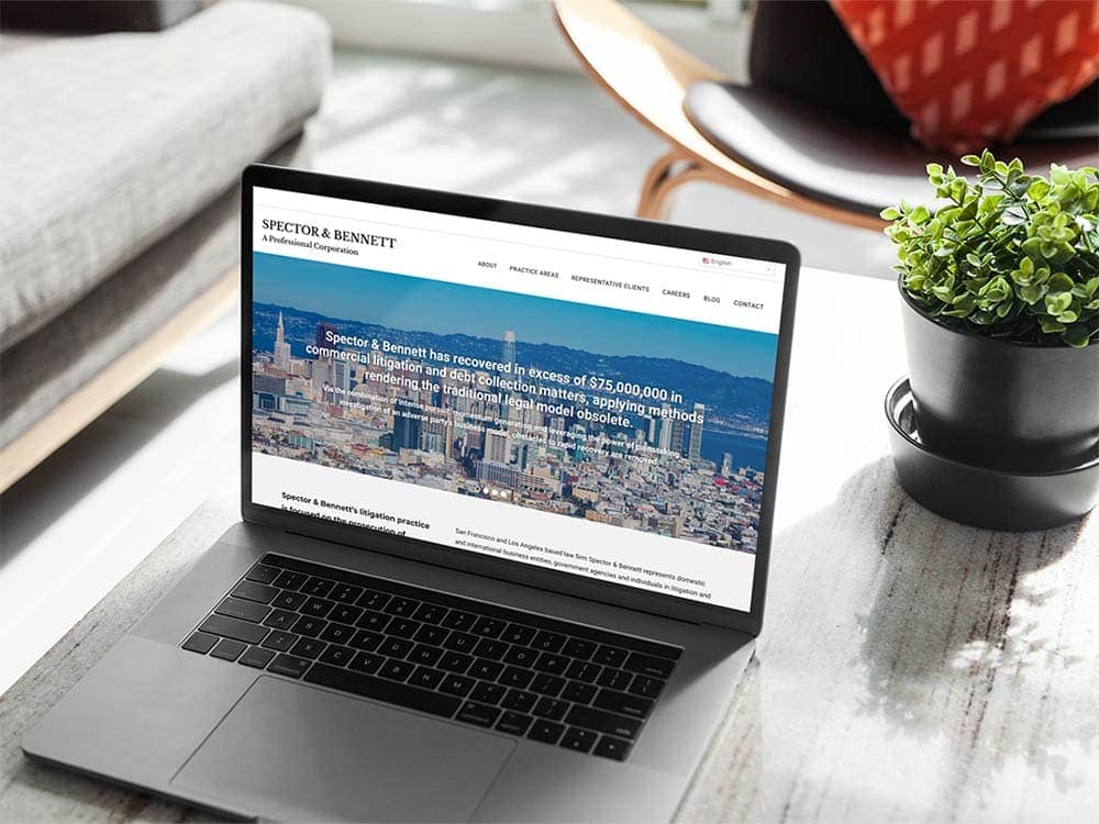
We’re also experts at law firms – we might not know the ins and outs of law, but we do know how to make law firms look good online. Both Seeley Family Law Practice and Spector & Bennet came to us this past season, and you can see the difference in the two companies just based on the design elements we used. For Seeley Family Law Practice we wanted to show their compassion, their assertiveness, so we chose earth tones and modern typography. For Spector & Bennett, we took a more old school tack, putting their many accomplishments and long history on display.
And finally, we got to work with an innovative company with a product we had never heard of before – have you ever heard of zero-alcohol cider, wine, and beer, infused with cannabis? It’s a completely new market that’s just beginning as cannabis is more and more widely legalized. Bevzero needed us to make a website for them that informed and excited anyone that was looking to get into the game, since they didn’t just want to make a product – they wanted to help anyone make it. We came back with this incredibly responsive, green-tinged (of course) page, and we can’t wait to see who they work with. Good thing they have an “industry news” tab.
It’s a big, bright, beautiful tomorrow. We are looking at that freshly paved road and hopping along, hopeful about what the future might bring. If you like any of the features you see on these websites, don’t hesitate to ask- we can do for you what we did for them.
See you next season!


