Let me tell you something about websites: they only truly exist if you visit them. They are very existentialist that way. And once you get there, once you’ve participated in the shared experience of our Razorfrog servers loading a website, and your human brain and eyes undertaking their perception, we want to make sure that whole thing was worth it, always, for any business that wants to exist in the infinite, unknowable web space.
For example: Starr King Open Space. The true best experience of Starr King is going to Starr King Open Space and walking around. Of course. But enhancing that experience? Oh yeah, we could do that. We made a website that highlighted everything this non profit protected space had to offer, from its flaura, all the way to its gosh darn fauna. Sign up for their newsletter, it’s worth it.
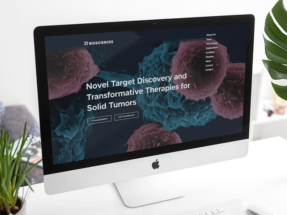
3T Biosciences traffics in the business of hope in the face of a disease we can conquer, so that’s what we wanted to highlight online. Head to 3T’s website and you’ll see that their space is as forward thinking as their cancer treatments, modern typography explicating their whole gamut of team profiles, publications, investors, news, and career opportunities.
Agility Hearing is all about modern solutions too – the type you can hear. The world of hearing aids is fast paced and crowded, but Agility Hearing is about clearing out the noise so you can hear what you need to. Same goes for their website. People just want to hear better, and we gave Agility Hearing the features to serve their tools with class and panache.
Things have got to be fun, too. And what’s more fun than Hard Seltzer? Mystic Reef knows the answer is literally nothing, that’s why they got into the fizzy alcohol business with Target. And this site is as effervescent and responsive as their slim cans and tasty flavors. The website we made for them highlights all of that.
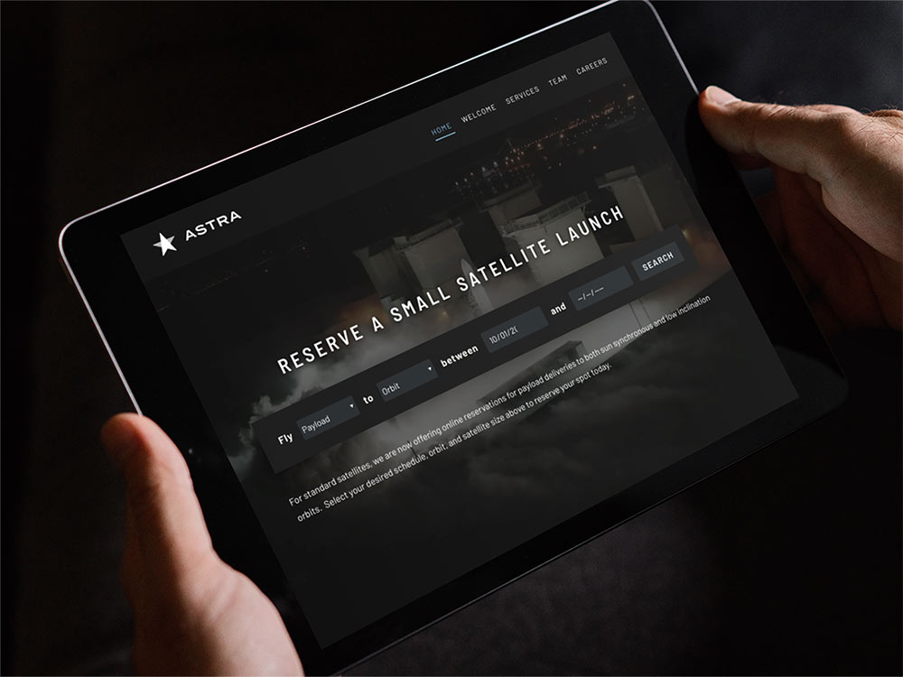
After looking into the ocean deep, it’s time to look at the stars, with Astra, a company that is working to provide low-cost satellite launches, thereby enabling a wave of innovation in low Earth orbit. The website had to look safe, it had to look futuristic, and it had to embody everything that astral bodies do – mystery, science, and the power of humanity. We did that with sans serif fonts and an eye towards our unknowable future.
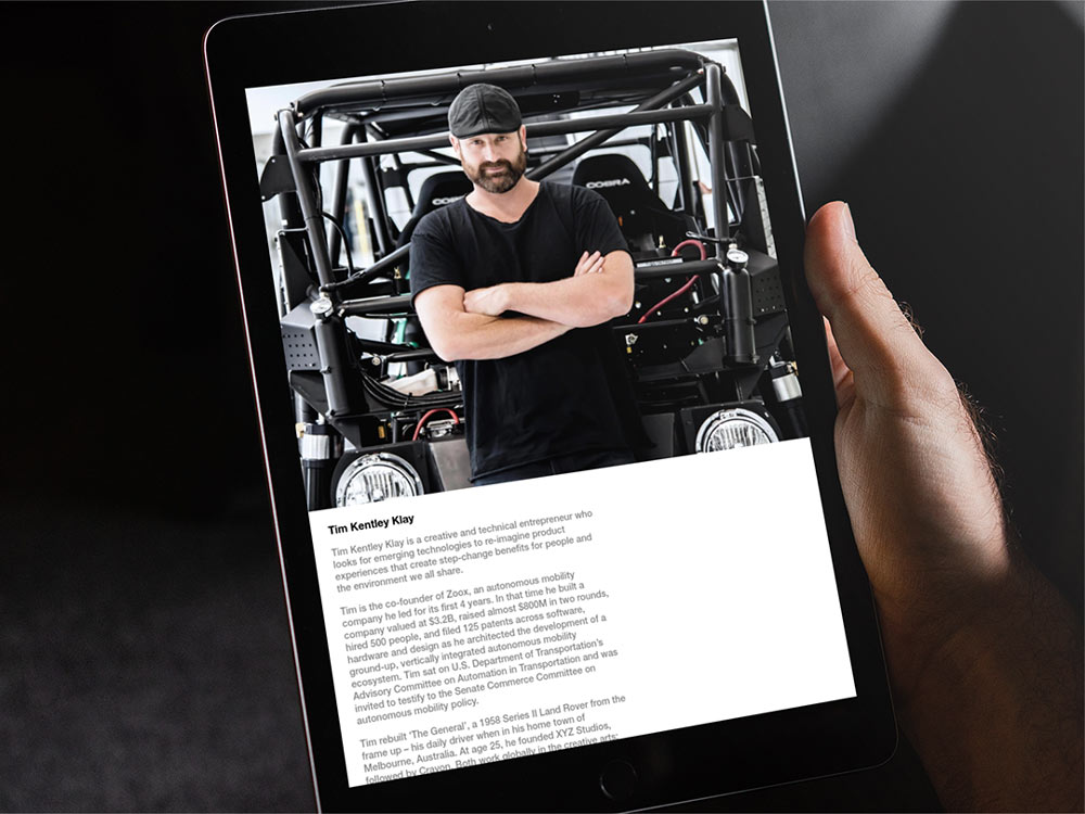
Tim Kentley Klay knows a thing or two about futures. He’s the founder of Zoox, XYZ Studios and Crayon. And as that founder, he needed a website that showed off his extensive, incredible portfolio. Of course he came to us. We think two or three or even four lily pads ahead here at Razorfrog. His work now has a livable space online that showcases his incredible feats of intelligence and expertise.
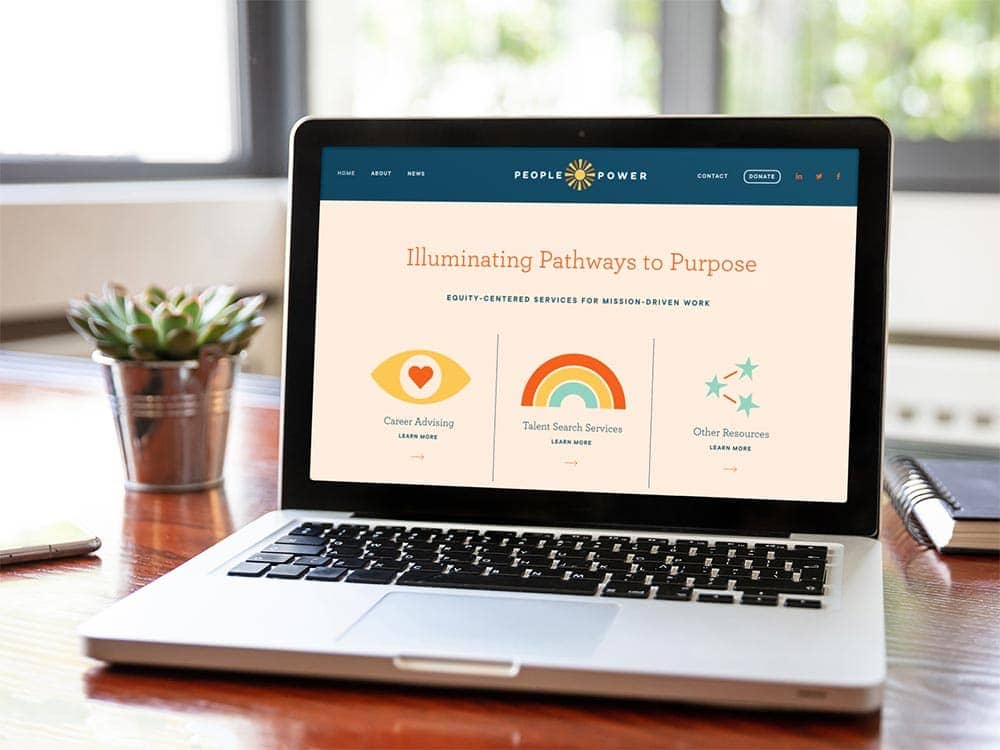
People Power came to us looking for a website that would draw in the talent that they were looking for namely: social justice minded people who need a movement to propel into a revolution. We took what they had and made it responsive and clear – ready to draw in the folks with a flair for advancing stuff we really believe in.
And then we launched the website for the San Francisco Center for Emotionally Focused Therapy too. We made all their information easy to navigate, updating what they had from a very previous incarnation of WordPress to the now, seamlessly, so their site is a therapeutic start to anyone looking to begin that journey.
Visit these websites. Participate in their existence, and they will make your existence better. That’s what we’re all about, here at Razorfrog, controlling the 1s and 0s and pixels and such, all so that our existence is just that much better. Not a bad mission, if we don’t say so ourselves. And we do. Not a bad mission at all.
Until next time! Happy web surfing! Click click!


