There’s this scene in The Apartment, Oscar-winning best picture from 1960, where there’s a long tracking shot of a busy office, filled with workers, that’s actually forced perspective: it LOOKED like a lot of desks and workers, when in actuality, as Wikipedia puts it, “successively smaller people and desks were placed to the back of the room, ending up with children.”
There’s a similar (but different) effect going on around Razorfrog, in that there’s now a kid around (welcome Tycho), and it seems like there are loads of people doing a lot of work, but in fact, our little team of industrious workers are just doing the work of dozens and dozens of employees. Let’s take a little tour, shall we?
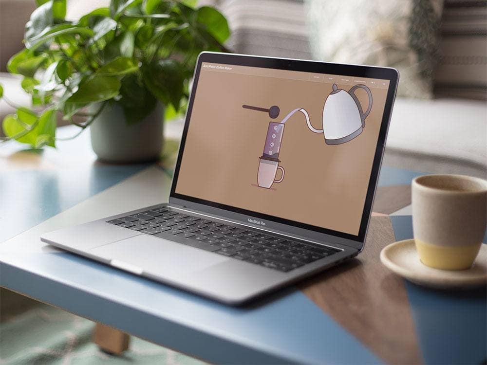
We recently had the immense pleasure and honor of working with AeroPress – a company that makes a simple coffee making machine that has made coffee for fueling Razorfrog endeavors all the way back to college days. Showcasing their product with clean design for newcomers and fans alike, adding in location services for finding AeroPress coffees made in coffee shops, and dedicating space to their championship are just some of the things we did on the front end. On the back end, it couldn’t be simpler for them to use. Just like their coffee maker!
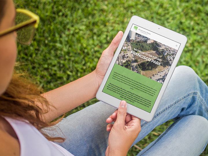
After coffee, you all have to see Francisco Park Conservancy. They’re taking an abandoned city-owned reservoir built in 1859, and turning it into a communal public space overlooking the northern shores of Aquatic Park. We worked with them first in 2015 and now that they’re closer to breaking ground, we brought an update to their website to present their latest community support. It’s an exciting project that we wanted visitors to the website to feel energized about.
How about a bite to eat? Batch & Brine opened their doors this Summer, and we were there to help – digitally of course. When people are just hearing of your restaurant, the website is one of the first places to visit, and it should feel kinda like sitting down at one of their tables – virtually. We made sure their gorgeous food popped in the galleries, and that you could order online. But mostly, we wanted the site aesthetic to match the restaurant’s overall feel.
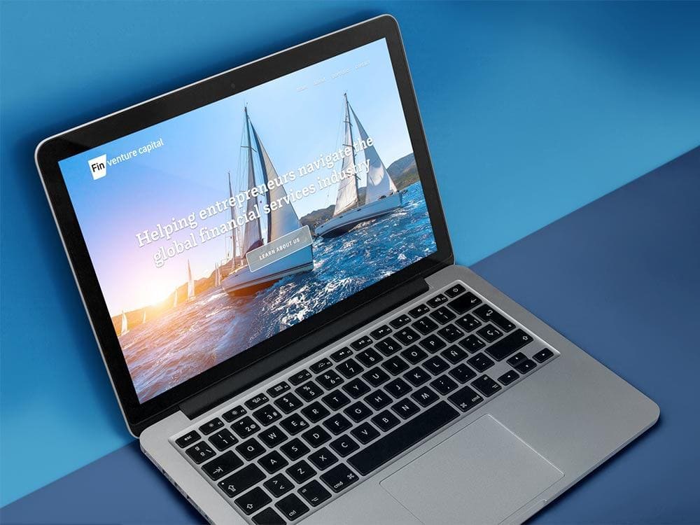
Speaking of feel, what better way to feel luxurious than on a sailboat? For Fin Venture Capital, they had to communicate lush opportunity, and we set to the task with beautiful imagery of the San Francisco bay. Plus, with caricature portraits for the staff page, we wanted folks to see a little bit of their personalities. Click around their site and you’ll see a responsive and dynamic portfolio display, along with a whole logo identity system that we are certainly proud of.
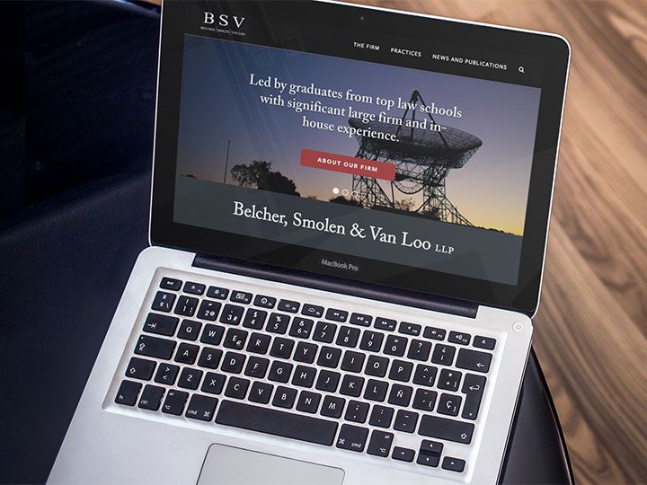
We feel that same sort of pride for the project brought to us by Belcher, Smolen & Van Loo LLP, a law firm with three veterans who all have their own innovative approach. The site is lean and serious, to show that they dedicate their time to their clients, and nowhere else. Plus, the site is bilingual – simply toggle between Chinese and English.
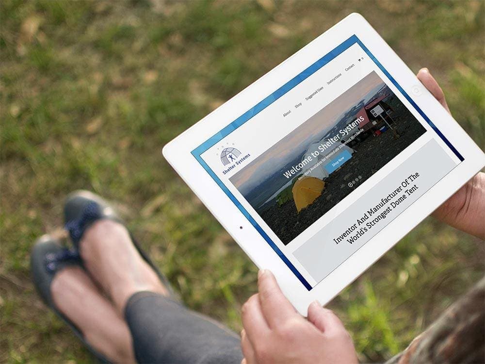
The site we built for Shelter Systems had to show sturdy reliability – they came to Razorfrog because they needed their site to be as dependable as their services. They had a network of sites that we streamlined into one, and then made their stock looked visually appealing and easy to purchase. Now, they can help disaster relief and humanitarian efforts with ease.
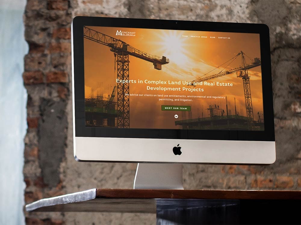
Ease of use is always at the top of Razorfrog’s mind – people have to understand who you are and what you’re offering in milliseconds of landing on your page. For Monchamp Meldrum LLP, that meant communicating their status as a trusted law firm, a Women Business Enterprise, and land use/real estate development specialty– from the logo onward. With our help, their site communicates the grace and professionalism of their legal expertise.
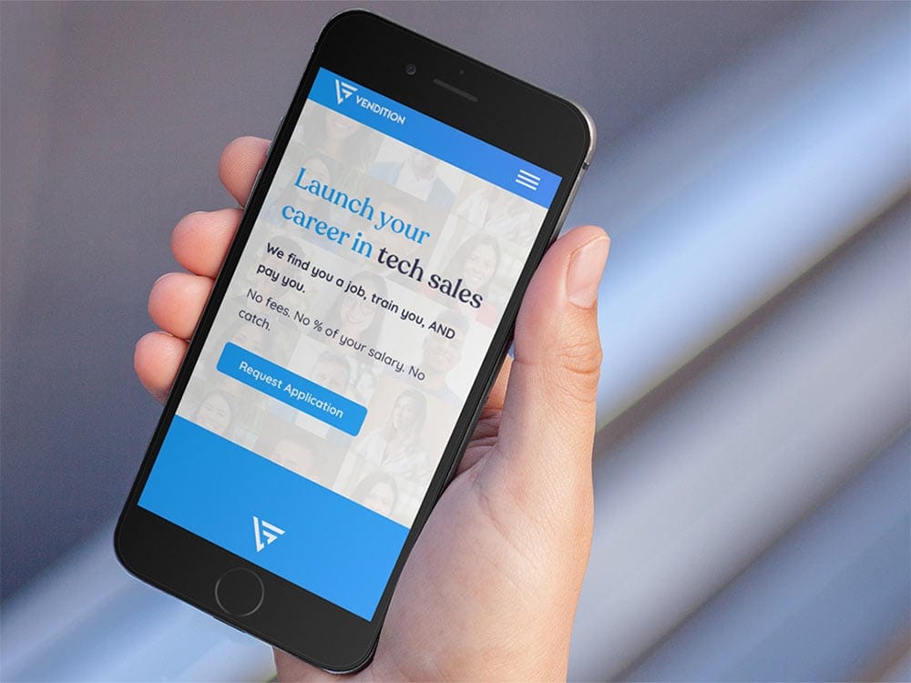
Vendition also had to communicate who they are, which is a company that helps in sales training and works to get clients competitive jobs in the tech sector. We made a page that presented all of their tech savviness, friendliness, general next level future thinking with a cutting edge aesthetic and site framework, adding the type of isometric illustration that firmly establishes a tech brand’s forward thinking.
No Filter Entertainment, a new entertainment start up out of San Francisco (where else) also had forward thinking to communicate, being at the forefront of digital media as they are. A company making media these days needs to be fearless and innovative, so we tried to show that’s what they are in every step of design and layout. Plus, we wanted to make sure their fantastic projects were well showcased and easy to find for potential viewers and clients. So they’re highly professional, highly creative, and they came to us to show off both of those qualities. We’re blushing!
It’s always a pleasure to work on such amazing websites with our little team of stalwart true believers. What does Razorfrog believe in, you ask? We believe that websites should be fun to use, and easy, and pretty, and the internet should be fast, and everyone has the right to clean water and a roof over their heads, and we believe that coffee is delicious, and so is hot cocoa, and we believe that autumn is coming and we can’t wait to see the leaves change. And you know what? Razorfrog believes in you, too.


