Recently, at Razorfrog, we keep doing what we do best: making great websites that look stylish and give your audience the information they are searching for. And we have been doing it for 10 years! Longer, if you count adding html to your Xanga! Happy 10 years of doing stuff online to us – we love this world made of light.
Here’s what we’ve been up to.
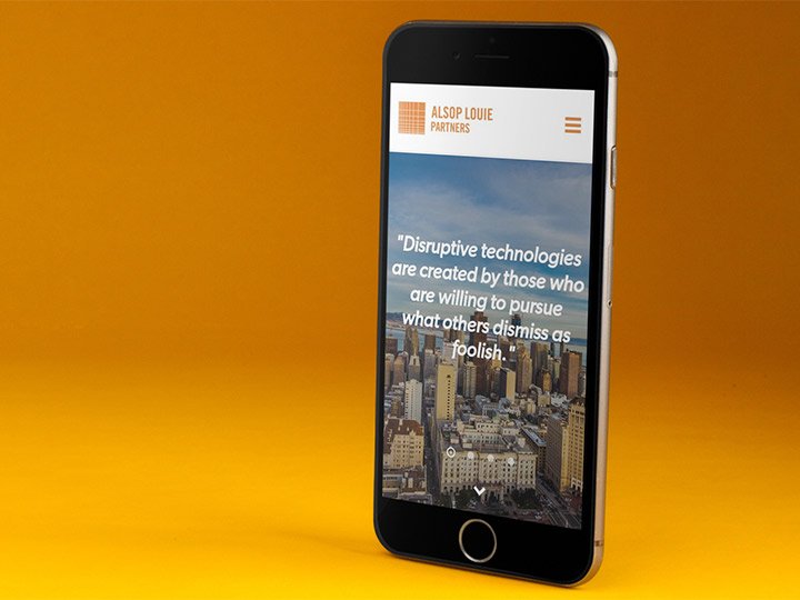
Alsop Louie Partners wanted to partner up with us to better announce the existence of their venture capital firm to the world. They needed something dynamic and fresh, so we delivered fun in the form of duotone, cityscapes, and lots of color, slightly understated, to show that they were serious. And then we made a better showcase of their successes – startups funded, client relationship networks.
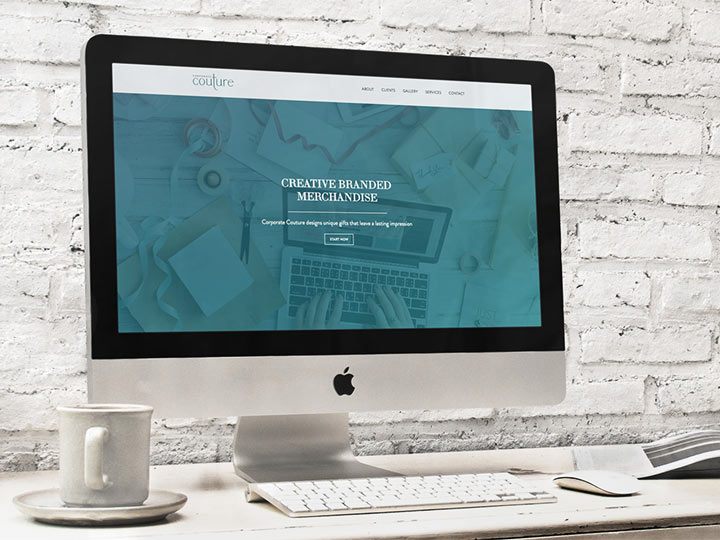
We are good at building showcases. Even for companies that are built to help showcase others, like Corporate Couture. We love when companies that know image is everything come to us. It means we have been doing our jobs right. For Corporate Couture, they make corporate gifts that turn customers into loyal consumers of the company. We made sure to keep the site clean and simple to show that they are chameleons – their aesthetic is clean and useful, and they are ready to make your company’s gifts stand out.
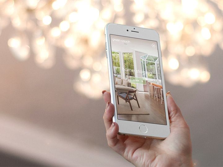
Using those lessons, we also took the same approach to Green Couch, a home staging and interior design firm. When you’re looking at a company like this, you need to see the designs they are most proud of, and you need to convey a certain mood. It was fun to work this into Green Couch’s own “rad elegance” ethos. And as they are working all the time, one of our main goals was to make their own portfolio easy for them to update.
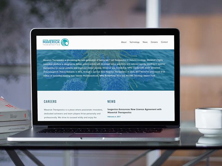
Elsewhere, in a different industry where image is everything, Maverick Therapeutics approached Razorfrog looking for the type of presentation that shows they are at the cutting edge of medical technology. From a company that’s offering cancer treatment solutions, you want to know the team involved at a glance, as well as what they are all about. With us, they got a website with branding that matched the spirit of their tech, as well as a website that looked good on anything that might be accessing it. You never want a first impression from a phone browser to not fit the screen – and we never let that happen.
In fact, we want that first impression to lead to increase traffic and sales for your business. For Jade Galore, we tasked ourselves with getting their extensive portfolio of jewelry and watches front and center. The pieces speak for themselves, and we let them. Anyone who sees the website is going to want to walk away with something made by their hands.
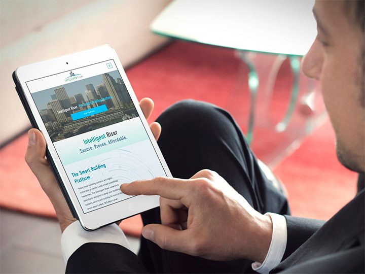
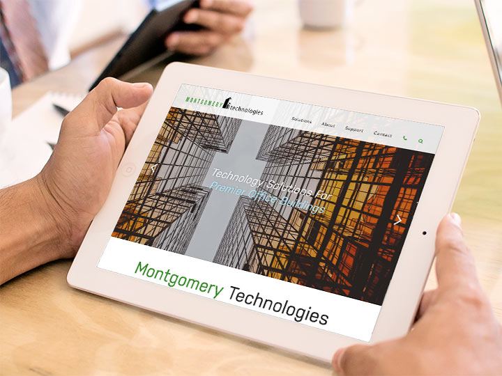
With our hands, we made Montgomery Technologies website back in 2013. That was 5 years ago, and it was time for a refresh. It’s gratifying to be approached again for a redesign, and know it’s just because they want a facelift. It means they know we stay current. And remaining “current” is important for a tech company like Montgomery. The architecture imagery we chose pairs nicely with their company’s aim to bridge real estate, business, and technology. We even did the website for an offshoot of their main brand – Intelligent Riser. We worked closely with IR to focus any browser on their aim to provide essential services with a simplified approach, 24/7/365.
This is what we do.
This is who we are.
We have been doing it for over a decade, and we are pretty darn good at it. Plus we love doing it! Isn’t that crazy? Even after all this time? We love this work, we love you, and we hope it shows.
Here’s to 10 more.


