In a lot of ways, the first few months of this year have felt like mini-years in themselves. So we have been keeping our digital noses to the 1s and 0s grindstone, creating good webpage waves for all you internet surfers out there. And that’s a mixed metaphor, but if restaurants can fuse cuisines, this copywriter can certainly fuse metaphors.
Let’s take a stroll down this digital beach, and Razorfrog can show you some of the new landmarks that we’ve constructed or redesigned!
First up is Presidio Investors, a private equity company in SF’s Financial District that does cool things with money – so we wanted their website be just as cool. They wanted all the presidios of the United States represented, so we did the research, and that research is well reflected all over the site, in imagery and feel.
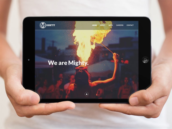
We stayed similarly focused on image for Mighty PR, since they focus on imagery for so many other industry leaders and upstart start-ups. They come up with neat campaigns for an incredible mix of clients, so of course they came to us to help them communicate that expertise in the webosphere.
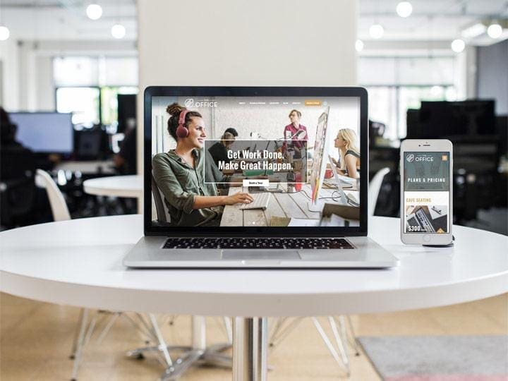
Next is The Office, a co-working space in Downtown Berkeley that has nothing to do with the NBC sitcom starring Steve Carrell. Since we work in a co-working space ourselves, we know how important community is, and that’s what we worked to highlight on their website, along with all of their awesome amenities.
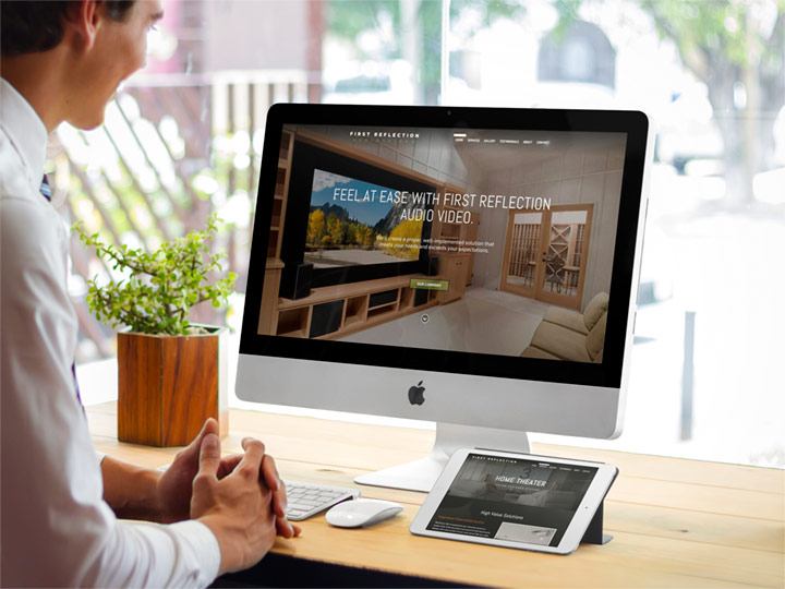
We also partnered with First Reflection Audio Video to showcase all their brand does. On one side, we produced an easy-to-update space to display the neat stuff they’ve already done for customers, along with an awesome portal to show off all they can do. On the other side, we helped them create a space to let customers brag about them in the form of testimonials.
Testimonials are also an important part of Liu Employment Law Firm, a San Francisco firm that focuses on advocating for worker and corporation rights. We didn’t have to reinvent the wheel for them, instead we focused on making their site look as trustworthy and professional as they are in real life.
Ignite Immunotherapy are the type of folks trying to reinvent the wheel, though. Their team is dedicated to the discovery and application of cancer and virus therapeutics, so we committed ourselves to making them a website that showed how inventive they truly are, communicating their work in an easy-to-navigate and understand space.
Razorfrog has put in the 10,000 hours on WooCommerce storefronts, and it shows in the work we did for Be Home, a brand that sources handmade, ecologically sourced products from abroad for the American market. We wanted to make their site as minimal as possible, so that their products and customer service could shine in all their diverse glory.
That WooCommerce expertise of ours is also showing its colors (specifically, green & grey) on Kanna’s website. We partnered with them to not only give them a nice storefront, but to also help educate/inform folks that might be curious about their products. They wanted a calming presence on the web, and we think there’s hardly a nicer place to browse and get educated about their extracts.
And hey, we might as well toot our own horn here: we stay committed to a responsive web. Every single one of the sites we make are responsive, showing up nicely and playing well with any device/browser that showcases your work. You never know who is accessing your website on their kid’s leap pad or Nintendo Switch.
See something you think would be good for your own site? Just ask. And thanks for taking the tour. We have a lot of fun over here, and it’s fun to share that fun with you.


