If all you want for non-denominational seasonal holiday gift exchange is an update on what Razorfrog is up to, then you’re going to be a very happy web reader and e-mail receiver!
In other words, here’s a round-up of the beautiful work Razorfrog has conducted over the past few months! Let’s get right into it.
When Exnodes came to us for their website, it was obvious that they needed a crystal clear website that explained what they were up to, both to investors and job seekers. Luckily, that’s what we’re into. It was like handing a football to a football team and asking if they knew what to do with it. In other words, we took their mission, and stated it with crisp animation effects and contemporary design. We totally scored a goal. And then we scored some more points when we had a similar task set to us by Sumeru Equity Partners. They needed to look as professional and trustworthy online as they do in person, because they are all about the marriage of innovative technology and values, so we delivered a confident website that puts their portfolio and expertise front and center.
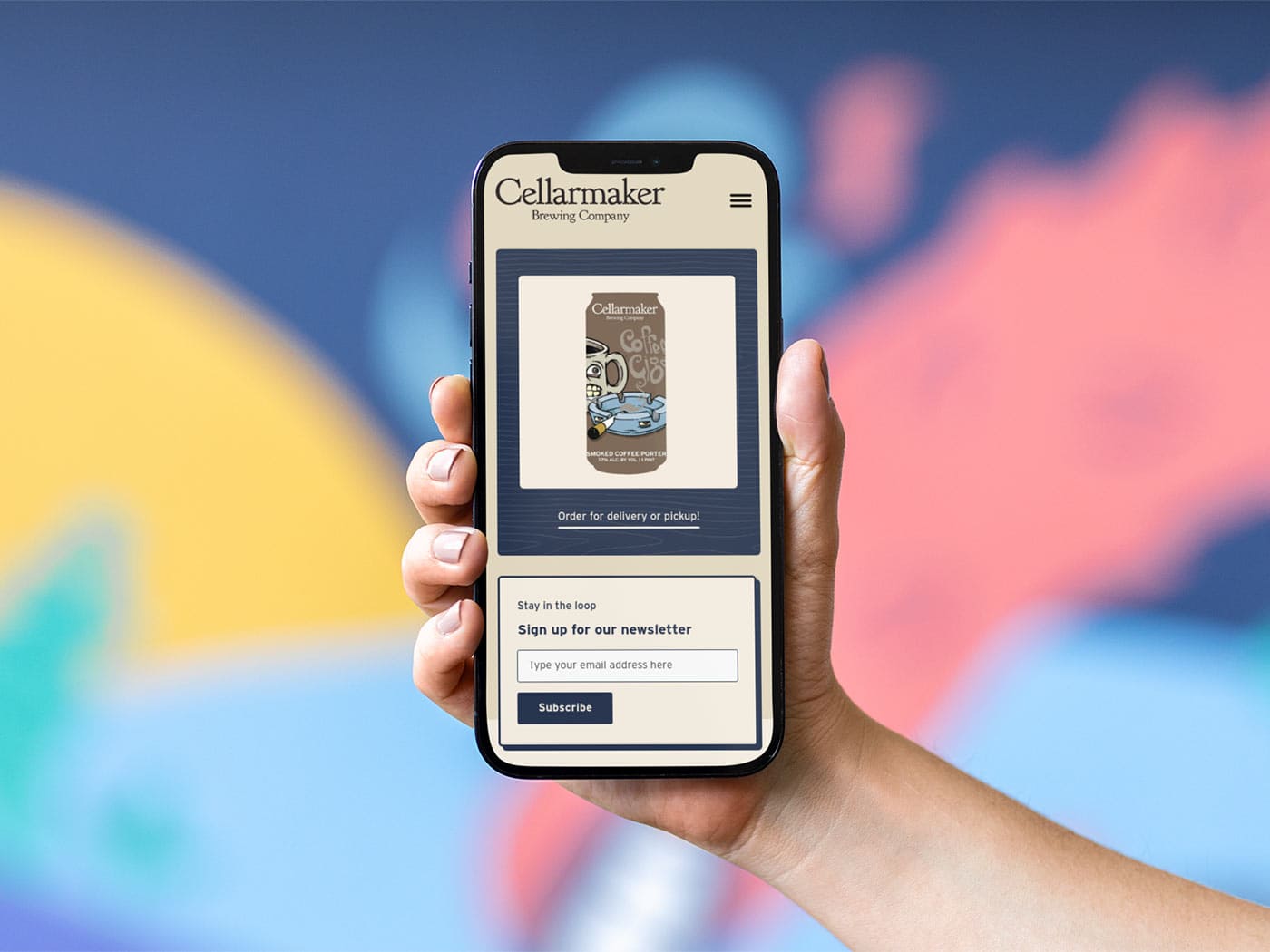
What’s another project we’re proud of, you ask? The answer is obvious: Cellarmaker Brewing Company’s redesign. We took the responsive website we made for them back in 2013 and re-tooled it to feel like a rustic home from the future – sleek and modern, but with a rough-hewn, lived-in, homey finish. We think that a future without beer is a future not worth living, so imagining a forward-thinking website for one of our favorite breweries and tasting rooms was easy.
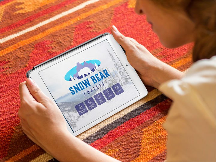
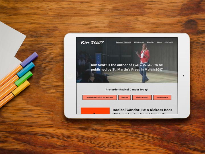
It was just as easy to work with Kim Scott to create her personal website after pairing with her so successfully for the launch of Candor. For Kim, we wanted the perfect showcase of her great ideas & literary oeuvre, plus we wanted folks to buy her books. For her site, we did some style matching to her book cover and some additional quirky color choices to show how cool and unexpected her ideas are. And we really love cool and unexpected ideas… like a ski-in, ski-out treehouse chalet. Sound like another crazy Razorfrog newsletter tangent? It ISN’T. We partnered with Snow Bear Chalets to present their gorgeous Montana properties, starting with creating a brand new logo and ending with making sure the stunning pictures of the place looked stunning on every device.
After a beer, a tour of Kim Scott’s ideas, and a treehouse chalet, you’re probably a little overwhelmed. Might we suggest checking out Oakland Floats’ website redesign? Even though they are all about premier sensory deprivation tanks, we didn’t want to deprive any senses on their website. Instead, we wanted to inform, get customers booked online, and show off everything they offer in calm solidarity.
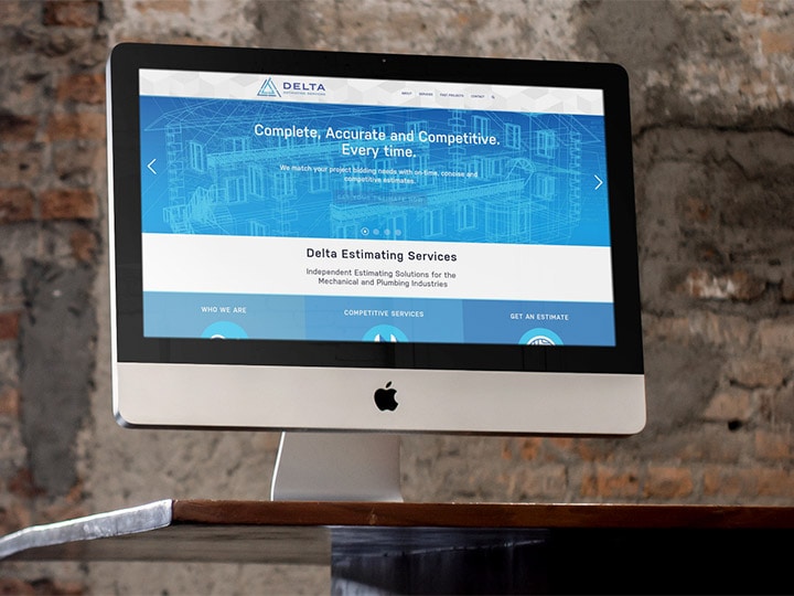
Now that you’re all reset, why not keep with the water theme and look into our work with Delta Estimating Services? They specialize in estimating mechanical and plumbing costs for clients all around the country, so we went about constructing a site and logo that conveyed their technical precision, years of experience, and industry confidence. Now they communicate their past projects and future plans in a beautiful, sleek interface.
Finally, and without further ado, there’s the Rising Strong website. Looking at existing designs of Michelle Gannon, PhD’s other brands, we made a website that played harmoniously with what has come before while still illustrating the original viewpoint of the Rising Strong personal growth program.
It’s been a pleasure working with all these individuals, companies, and brands; coming up with intriguing designs and solutions, and generally doing our part to make the world wide web a pretty place to be. If you find yourself asking why your website doesn’t have a feature presented here, just ask us! We are happy for new missions and challenges, and we love you for being open and honest in your communication with us. It’s the hallmark of a healthy relationship.
Thanks for touring. Now go find yourself a candy cane/gingerbread/sugar cookie flavored something or other, and have a cheery holiday!


