Spring has sprung so far that we’re basically onto Summer, so we are springing these websites on you, summer-style, in a hopefully delightful and welcome way! Plus, springing is just what frogs do, summer or not, you know?
If you think you have a future in selling it, Sales Bootcamp might already be familiar to you – they are the original free online program for launching a career in tech sales. Their website had to display their ties to tech savviness, as well as appeal to more folks that they can turn into success stories. Razorfrog worked behind the scenes to make all their goals and possibility generation visible on any web browser.
Ball Security and Patrol Services were similarly interested in making their outstanding services being more outstandingly visible. That meant incorporating the elements of safety and security that they stand for into their site’s design. Now their services are more easily available to keep all sorts of property and humanity safe.
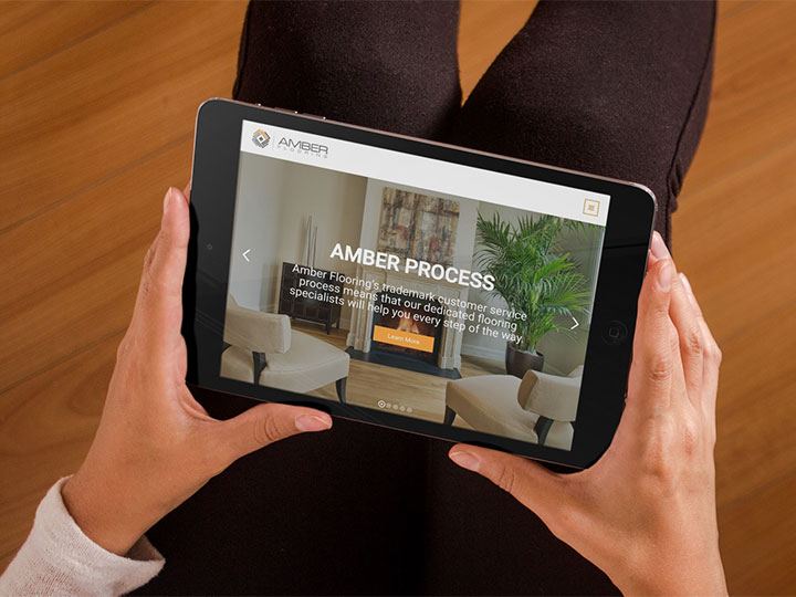
And just like you want to be on sure footing with your security detail, you definitely want to be on sure footing with your flooring. That’s why we were excited to work with Amber Flooring. We at Razorfrog are fully aware that we link good website design with good in-person design, so someone who designs floors needs a website that provides a good view from all the right angles. Now you can get floored by what they offer, check out testimonials, and request a quote, all in one responsively-designed place.
We also had the great pleasure of helping launch a website for InterQ, a qualitative and quantitative research firm. They know how to make things known for all sorts of businesses, from the startup to the established brand. They wanted to turn folks who came to their website into real leads, so that’s what that website is designed to do. Only click and check it out if you’re okay with being convinced to dig up some data from your userbase.
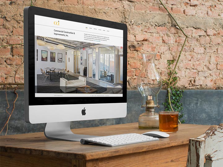
Just looking to dig, maybe because you want a cool new pool, or a sub-basement turned ping-pong champion training dungeon? CCI General Contractors are the ones to help do your physical building, and we were thrilled to do their web building. When you’ve got 30 years of service on your contractor’s belt (with the loops to prove it), you want your site to communicate all of that experience and expertise. So we came through, highlighting their best work in real “we are the best” fashion.
The Fischer-Harbage Agency in Brooklyn wanted to be sleek and memorable too, but they also didn’t want to lose their original website’s simple design. Razorfrog worked closely with the agency to better show their roster of books and services to any potential clients or colleagues while still maintaining the basic bones of how they looked before. Add in responsiveness and an easier-to-update backend, and that was one heck of a collaboration.
Cantina Verde, with their simple and delicious menu, wanted to communicate their simplicity and deliciousity online, while making their website more useful and user-friendly. Razorfrog asked, what does a restaurant need on a website? The answer: menu, contact info, business hours, and catering info. That’s it. So that’s all their website is, while being memorable at the same time. Muy caliente.
With spring already seemingly like a distant memory as the heat engulfs us (sometimes) in our sprint through summer, let’s all remember that it’s always cool in front of a computer screen, hanging out with Razorfrog. If you see anything you like on these websites and want those features on your own, don’t hesitate to pick up an internet device (after you towel off of course, since you’re near a pool, as it’s July). We are available across platform, just like all of our websites, responsive and accessible from any screen you might be near enough to tap.


